Thursday 8 May 2014

Drawing Day at West Dean

I am half way through a Foundation Diploma course at West Dean https://www.westdean.org.uk/CollegeChannel/ShortCourses/FoundationDiplomainArtDesign.aspx. As part of the Diploma, students are invited to attend "Drawing Days" - a useful way to spend time with other students, catch up with the tutors, have a tutorial and spend time in this lovely place. I attended my second day last week.  I was more relaxed this time, having less on mind and knowing, to a degree, what to expect.

We were asked to consider structure in drawing, composition and particularly the potential of zooming in to part of the subject - in this case architectural plants. 

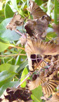
I chose a plant because I became fascinated with the negative spaces between the leaves and first drew a small thumbnail of the spaces in a selected part and then repeated it by drawing the leaves themselves.  It is interesting how different, yet similar, these are. I prefer the second of the drawings - it seems more balanced as a design.

I then drew a larger drawing of a segment, really enjoying pushing the charcoal around, and found myself responding to the shapes of the leaves etc.  The feedback on this was that it might be more effective if the darks, or some of them at least, were darker.  I will carry on working on this and recording the changes.

 The plant was very colourful, with a yellow and red bract so I decided on collage for my next piece.  I only had a small pack of materials with me - magazine pictures and photocopies of some of my own pictures so was limited in choice but this was useful as I had to make do and be more creative with my response.  I drew the plant on top of the collage in black felt tip to emphasise the shape.

Later when I was uploading photographs of this, I accidentally zoomed onto a part of it and was surprised by the result. It has potential for further development - perhaps into print.

The next two pieces of work developed on from the collage - first drawing the basic shapes and adding some grey tones - and then just looking at the negative shapes

 I have found myself developing drawings more and more recently.  This is a direct result of the Creative Development weekend in December at West Dean for Diploma students where we were introduced to the idea of a "body of work".  I can see more potential in the collage and drawings developed from it and intend to work on the ideas generated.

After lunch I had a look at another plant - a succulent with a stem of very small flowers.  I enlarged them, trying to identify the structure - finding this difficult without a magnifying glass and then used these drawings as a basis to draw larger and then larger still in light sienna and black drawing inks.

This a great day - I was surprised how much I achieved. I feel all the drawings have potential for - by developing the ideas in the drawings but also in cropping them and looking at enlarged segments for development

Saturday 29 March 2014

Reflections on the course

The course hasn't been an easy ride -  partly due to an uncomfortable and, to my mind, unproductive,  relationship with my first tutor.  In distance learning, more than in regular contact learning, this relationship is key.  The process of distance learning is quite lonely and isolating no matter how wide or close a supportive network there is.  If the relationship with the tutor doesn't gel, then there is no basis of trust developed and this makes interpretation of critical assessment more difficult.  I personally found my first tutor cold, distant, and with no apparent empathy or understanding of the needs of a mature student, despite his often stated expertise and experience.

My original intention when starting the course was purely personal development rather than a track towards obtaining a degree. I was confident that my previous wide range of workshop experience had been sufficient to give me a good grounding in the basics of technical and variety of printmaking methods, especially after a discussion with OCA staff.  I kept an open mind about assessment but, as my confidence reduced over time I realised it would be a mistake to put myself under the extra, unnecessary, pressure of the process and  my own assessment of the prints I was producing for the course was that they were not up to my personal standard.  I was able to produce good quality prints in workshops and when working on personal projects at home but my skills and techniques seemed to fail me time and again when producing prints for the course.

The first assignment went relatively well but I seemed unable to make decision regarding the final treatment and experienced several false starts - eventually settling on a very standard dry point. Looking back at this work now I feel that some of these abortive attempts hold quite a lot of potential for development especially the long lino cut with abstract inking, with perhaps the addition of chine colle or even combining the lino and the dry point.

Looking back at the assignment pieces I am surprised how my confidence dropped - on reviewing them I think they are reasonable prints. I like the Cedars and also the abstract piece is very successful - the printing techniques are alright as well.

One of the comments that I was dismayed at from the assignment feedback referred to my sketchbook work.  I took this very personally - too personally in fact - as over time I have recognised that more does not equal better or development.  My drawings and sketching for the project were predictable and boring and,  where I did show some imaginative flair, I failed to develop the ideas to the degree that I could. However, I still feel the tutor comments could have been phrased in a more constructive way.  My sketchbook work has developed a great deal over the course - I am continually exploring and developing ideas as well as using more mixed media techniques in sketchbooks while developing ideas and this process started after the first assignment feedback.

Due to the first tutors' personal preferences I changed the way I recorded progress for Assignment 2 - both my journal,  where I Iogged exhibitions, books, research etc and the learning diary for which I used a blog. I found this change difficult since I had kept my journal/log book for several years and had developed a method that suited me.I had also become comfortable with keeping  a blog, so changing both to typewritten versions to suit the tutor, who didn't like hand-written or electronic methods of recording, seemed an added and uncomfortable complication and not in accordance with the preferred methods of the OCA.

I struggled with assignment 2, the abstract assignment,  and I received very negative feedback - which was deserved - with little constructive advice. I decided to contact my tutor and ask for advice during the process of assignment 3,  so that I could be more confident that I was on the right track,  but this decision was not well received and I was discouraged from contacting him.  He had recorded all the times I had contacted him which included courtesy e-mails advising him the work was in the post.  Perhaps rightly so, but since I knew that at least one other student had been encouraged to contact her tutor with problems and to ask for clarification after the feedback, I felt even more isolated and was close to giving up the course.  After several months of indecision I accepted a friend's advice and asked for a change of tutor and was very pleasantly surprised how straight forward this process was. The OCA office was very supportive.  However, the delay in asking for this change created a real pressure for finishing the course.

 My new tutor was very approachable but I found I had lost so much confidence in my ability and technique that I struggled to develop the discipline and structure of regular printmaking that was one of my primary aims for starting the course.  A major family loss at this time put everything on hold and led to a recurrence of depression.  I was then informed that I was to have a third tutor and this couldn't have come at a worst time for me.

The new tutor was communicative but I still struggled with lack of confidence, depression and inertia.  This prevarication meant that I was fast running out of time to finish the course within the two years deadline but decided that I needed the closure of finishing the course even though I was very dissatisfied with the prints I had produced. I decided to apply for an extension on the grounds of family loss and depression and was granted three months extension.  This extra period coincided with the first anniversary of my Mother's death and I again experienced debilitating depression but I persevered and eventually was pleasantly surprised at the quality of the final print.

Conclusions
  • distance learning works for me for academic subjects, my original degree and Masters degree were achieved through distance learning - but I have recognised that I benefit more from workshop environments for art projects
  • the tutor-student relationship is key - in a similar situation I will be more proactive
  • a technical subject such as printmaking will always require the backing of a tutoring situation 
  • reviewing the work I have submitted, I have found unforced errors and most pieces which I know could have been much more competently printed. I have disappointed myself - but these pieces hold potential and I intend revisiting them and re-working and developing them - something new for me and a mindset that this course has enabled me to develop
  • I am on the way to developing my own voice - one of the aims of the course
  • I have recognised some strengths and identified weaknesses which I will address
  • my sketchbook and development work is evolving and getting more exciting and is full of potential
  •  Once I know the standard techniques and processes I am more prepared to explore different methods just to see "what will happen if I do...."  - accepting the value of each exploration 


Monday 24 March 2014

Cedars of Attingham - final print

After looking through various sketchbooks, I decided to revisit the subject that I looked at in the very first assignment - the beautiful cedars at Attingham Park. I have a wide range of drawings and paintings of these trees which I have visited regularly over a number of years.  They are very susceptible to wind damage and therefore change slightly most times I see them so, after a few extra drawings,  I settled on a very simple view of two cedars close together which, for me, sums up these very beautiful, ancient trees.  I also felt this subject was very suitable for Japanese woodblock.
 
I scaled up the chosen drawing and made a tonal sketch in sumi-e ink with the intention of translating it into a colour sketch.
 This reminded me of the proofs of the magnolia that was proofed in sumi-e ink on the course with Rebecca Salter in October and I decided to proceed with a tonal print rather than colour.

I traced the image to work out the tones and decided on 4 plates. The next stage was to transfer the images to 4 woodblocks, 

paying extra attention to the kento marks since this is the basis of accurate registration. 
Remembering Rebecca's and Sara's advice I made sure that my knives were sharpened at regular intervals and that I didn't carry on cutting too long as I had made mistakes in the past by cutting when tired


The paper requires several hours or overnight to evenly dampen so making the paper stack the night before the first proof was very important. Newsprint is wet with a brush and stacked, interlaced with the paper which is also wet on one side, finishing with three pieces of wet newsprint. The whole package is then wrapped in plastic sheeting and weighted down with a drawing board and left overnight.  In the morning, the printing papers should be evenly damp to the right degree - without any patches of shine
Printing the first set of proofs gave me the chance to try out the dilution of the sumi-e ink. It is very pale but gives a good depth when layered by the four plates. I printed each plate separately and then overlaid some to look at registration.

I used the individual plate proofs when cleaning the plates to indicate where I needed to clear and even to re-cut.

   The corrected plates after re-proofing require a little more cleaning . I like the sesame effect especially in the foliage but want a contrast with the trunks and branches so re-inked just the trunks on plate one using a small paint brush to apply the ink rather than brushing it in with the normal Japanese inking brush. This resulted in a thicker more even coat of ink, which when printed resulted in a more uniform and denser trunk - contrasting as required with the lighter foliage.  I think this effect adds to the print. 

The sesame effect or "Gomazuri" is an effect when the flat wash typical of traditional Japanese woodblock printing has not been achieved often through error.   It is now seen as a valid technique and can, and is, used as a positive decision but editions with consistent qualities are difficult to achieve over many prints.  After some more adjustments, I inked the trunks and branches with a small paint brush rather than the traditional brush while inking the leave clusters in the traditional manner. This resulted in a looser sesame effect which I feel adds to the print 


After more clearing I proofed again and tried out some Tosa Washi paper which I felt was most likely too thin for this technique. Tosa Washi is very thin and when damp, very unwieldy.  It slipped when I was trying to register it in the kento marks on the first block producing almost a ghost image where the paper touched the inked plate. Also the paper tore during burnishing. However the proof gave me the opportunity to try the technique of adding colour to the print through the back of the print - a technique that I intend to use more in the future.
 
The final proof after more clearing required some padding to keep the paper away from the parts of the plate I didn't want printed - this prevents some of the faint ghosts marks where the plate, where cleared, has swollen due to the dampness - the sumi-e ink is very liquid hence the wood swells in some places where the layers of ply are perhaps uneven.

I had proofed on Hosho paper from a pad which wasn't quite big enough to cover the whole plate with an even margin around the image.  I decided to print on some hand made paper brought back from Japan - the make and content unknown - and some Masa paper. The hand made paper was softer and absorbed the ink better than the Masa. The print clearly shows how the ink is absorbed by the paper rather than sitting on top of the paper as in traditional western methods of printmaking.


Reflections
  • the simplicity of the design expresses how I feel about these beautiful trees.
  • I feel the sesame effect enhances the image -  giving a different weight and texture to the foliage mass
  • I have used Jo McChesney's prints as inspiration but have given my own slant to a much loved personal subject
  • I am pleased with the grey tones of the sumi-e ink and this reminds me of the tone and colour of the print purchased from the artist who inspired this print,  but do intend to ink the plates in a blue grey in the future
  • my cutting technique has improved over the course of the past few months and I feel the organic marks are particularly successful
  • the registration using kento was successful and proved a very easy method to use
  • I will continue to use hand colouring, particularly of proofs, as a well to identify different colourways
  • I need to experiment with more paper samples in order to discover the papers that work for me and that give me the effects I want to achieve.

Wednesday 15 January 2014

Assignment 6 - synthesis - part 1

This assignment calls for a print/prints  "consciously emulating"  the artist chosen for special study.  I chose Jo McChesney - a contemporary print maker - whose work I admire.  http://www.rbsa.org.uk/members-associates/associates/view/194/Jo-McChesney/

I have a piece of her work and have attended a workshop run by her.   Although I have  enjoyed the study which included looking at the origins of Japanese and Western woodblock printing and identifying their influences on Jo's work, I realise it would have been a lot easier to have chosen an artist of whom a lot had been written - there would have been more information available and more images.   However, the study has given me the opportunity to identify in greater detail what it is I like about her work and that has led me to a greater understanding of what I want to express and how I want my prints to develop.

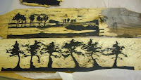
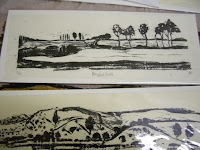
Jo works in woodblock. She trained in Kyoto after training and teaching illustration, design and textiles.  She uses traditional methods but with some modern materials such as oil based inks and rollers rather than the traditional water based inks and barens of the traditional Japanese.   Her works tend to be low key, almost monotone. She is increasingly experimenting with wood other than the traditional plywood of woodblock printing such as the fence panels shown here, and with her marks that often reference more traditional German Expressionism that Japanese ukiyo-e.

I will use woodblock for this final print because it is a medium I am very interested in and like to explore,  and because it is Jo's favoured printing method.  I felt that the design for the final piece had to aim to demonstrate the qualities that I like in Jo's work - the quietness, "fleeting moments", nature and have a meditative quality.  

I used mind mapping for the first thoughts for the assignment - bringing together words that were brought to mind when considering Jo's work and the research I had undertaken for the study. I started to look to look at trees, the layers of trees in the landscape, the tops of trees against the skyline or ripples and droplets of water but felt that these images would be copying Jo's work and that I would have difficulty moving away from direct imagery that was more about Jo than about my inspiration from her.

I spent time looking through photographs I had taken.  These tend to be visual reminders of images that I felt, at the time, would bear further investigation and I found many of leaves against the sky. I also found many photographs of dead leaves as I like the sculptural shapes they make as they desiccate.

There is a Japanese concept called "wabi sabi" - basically it is an appreciation of  the beauty in everyday, often imperfect objects.  I feel that this concept sums up Jo's work and that the dead leaves with the memory of summer but with a particular beauty of their own in their form and colour are often overlooked.

"Wabi sabi art challenges us to unlearn our views on beauty and to rediscover the intimate beauty to be found in the smallest details of nature's artistry" from Wabi sabi: the japanese art of impermanence by Andrew Juniper http://www.ribabookshops.com/item/wabi-sabi-the-japanese-art-of-impermanence/75151/

I have a small collection of leaves collected on walks and gathered more to draw and compose.  I feel that, in the past, some of my prints have been just studies or vignettes such as this small woodblock that was completed on Jo's course, so wanted the image to be a complete image rather than just a study of dead leaves.

I have drawn some images but can not resolve, to my satisfaction, the feeling that the resultant image would be a vignette rather than a composed completed image, so have returned to my library of images and sketches for inspiration. Looking at Jo's images again, I feel that they do have a simplicity, an abstraction about them. She has the ability to cut away extraneous detail and allow the view to focus on the form and this does enhance the feeling of a frozen moment in time. 

I have decided to sketch and develop more themes to give myself time to decide on the image that I wanted to explore further.

Sunday 29 December 2013

Assignment 5- imagination

This assignment called for one large collaged mono type on an imaginative theme or a narrative sequence of 3 -5 prints, from own choice print medium.

Inspired by the contextual studies into multi media and narrative prints, I decided that I wanted to produce a narrative sequence. I was considering using a story or nursery rhyme as the starting point when the idea for the print came from a real incident.   A very large spider ran down the bed when I was quietly sitting reading.  This reminded me of the Miss Muffet nursery rhyme and this in turn, of the Nursery Rhyme series of etchings by Paula Rego, which includes a Miss Muffet piece http://collection.britishcouncil.org/collection/artist/5/18742/object/40023/

Using the traditional nursery rhyme as the inspiration, I sketched a figure sitting quietly reading under a tree with the spider hanging high above.  Then a series of thumbnails


 I feel the first and second pieces work as stand alone pieces as well as part of the triptych. However the third piece showing the figure running into the space doesn't work alone.  It  is a boring very plain image without a story.

I then drew a figure on a bed with the spider close to the leg 
but felt the figure jumping off the bed didn't work -and also my drawing wasn't up to portraying the figure well enough and I was unable to transition for a print from 2 into 3 so went back to the idea of a figure sitting under the tree. I tried the "what if...."game to try to resolve the issue of the third piece working as a stand alone.

The alternative storyline involves the figure remaining sitting - in the second print she is reacting to the spider and her hand is raised - to fend off? in alarm? - who knows. In the final print the spider is sitting in her hand on top of the book and she is looking intently at the spider.

The next set of thumbnails considered backgrounds, including trees and hills but I felt the detail on the background diffused the image of the figure and the spider.  I then looked at different positions for the figure - facing left and also facing centre under a much larger tree.

 This minimised the figure making the tree the most important element and this also detracts from the image. I felt the figure facing centre made the image feel to symmetrical and when the figure faces left, it seems to be counter indicative to how we in the west "read" images - the image of the figure facing right and with just the side and branch of the tree showing gives the right emphasis to the figure and the spider and the right balance.

I was still trying to resolve the printing method - my preference would be for an etching as a homage to Paula Rego but I do not have the time for the necessary visits to the Print Centre so was considering collograph/lino cut when I came across the method of silk aquatint in the blog of Sue Brown http://suebrownprintmaker.blogspot.co.uk/2013/12/end-of-term.html  The method gives the deep and varied tones of aquatint but is a collograph method.  I researched the method and realised that prints I had admired and thought of as etchings by Sean Harris http://www.arts-engine.org.uk/index.php?id=44&action=viewOrganisationData&returnID=28&letter=H&OrgID=715001were in fact, silk aquatints.  I therefore resolved to try the method for the assignment. Although this risks prints that are not up to the quality required I feel that it does fulfil the brief to try "experimental and exciting techniques".

I made a trial prints to experiment with the technique. On the plate, I used wood glue to draw the image, but although this is white when wet, it dries clear which caused a problem when inking as I couldn't see the image against the dark acrylic background.  I then made two more plates and drew simple images in white acrylic - building up the thickness in places over a couple of days as the layers dried and also scratching back to create lost details in places. I also amended the original trial plate of the figure with white acrylic to create more tone and texture

After experimenting with the plates, printing them and subsequently building up texture with white acrylic, gloss medium and wood glue - I am still not satisfied with the level and evenness of tone and realise I need more practise with this technique and also some expert advice and am not ready to use the technique for this project.

I re drew the sketch looking at the potential for mark making in lino cut or wood cut.  I was inspired by the lino cuts of Ian Phillips http://www.reliefprint.co.uk/and the wood engravings of Colin See-Paynton http://www.see-paynton.co.uk/index.html and used some off cuts of lino to develop the marks on paper into lino cuts.

I cut the plates utilising some of the mark making from the trial plates. After several proofs I decided to use stencils to reduce the marks from the cleared areas and proceeded to print a small edition of 3 prints of each plate. I decided to use a dark grey ink as I felt black was too harsh and experimented with various combinations, finally deciding on a mix that included a touch of blue.

I started out by hand burnishing on newsprint but reverted to the press for the prints on Fabriano Rospina when I found that I cannot form enough pressure using hand burnishing on the thicker paper

 I am reasonably pleased with the prints. Some marks have come through on the arm and the trousers but I feel these do relieve the large blank space. 

I experimented with hand colouring on one of the proofs.  I prefer the original monochrome images as I do not consider colour ads anything to the image.


Reflections

  • The softer grey of the prints was more effective than the harsh black of the scaled drawing.
  • The stencils to protect the unprinted areas would have been more effective if cut more accurately and from thicker paper
  • With lino cuts I aim to clear all the extraneous marks but looking at the prints, I feel that the marks left he arms and trousers enhance the image.
  • I am pleased with the design but like the effect of the enclosed wood in the experimental print where the tree plate was printed upside down. This provides an opportunity for future development and ties in with my wish for my work to have more layers of interest

  • I don't feel that I fulfilled the brief for explorative or experimental print-making. However, I have tried new methods - silk aquatint and hand colouring - and have explored a wider range of mark making for these lino cuts 
  • I intend to further experiment with silk aquatint and hand colouring
  • I enjoyed the process of developing a suite of prints to tell a story.  From my research into narrative art works I realise that my work is only two dimensional and would benefit from more time spent developing ideas so that the final works are more complex and offer the viewer more interest.

Sunday 1 December 2013

Texture using collograph

The requirement is for a collograph print with the emphasis on texture made from jigsaw blocks.

My first thought was an idea for a print based on a drawing I worked up inspired by a drawing of pears on a plate by Ben Nicolson.  I chose apples as a theme I return to many times when drawing or doodling. However, I felt that it wasn't suitable for a textured collograph as I couldn't "see" the apples with texture.  I then considered a landscape based on the view of rape fields at Rabley Drawing Centre.  I simplified and abstracted the design and felt that it was developing along the right lines.

However, when I came across some ornamental gourds, their textures, shapes and colours seemed very applicable for a textural print. 

I drew several sketches and produced some collages but realised that I needed to look in more detail at the composition - bearing in mind that the final design needed to be suitable for jigsaw plates. I used the Ben Nicolson again as inspiration in the way that his composition used the stalks of the pears to draw the eye around the drawing.  While looking at this stage I also checked the suitability for a jigsaw print by drawing thumbnails and dividing the image into 3 blocks.


 I cut the plates and by referring to the sketches and textures of the actual gourds decided on the following texture:
plate 1 -  masking tape with gaps which are scored with craft knife ,  plate 2 -  ghesso - roughly applied with varied depth and for gourds with bumpy texture - wood glue roughly applied and while wet, textured with medium carbonumdrum and plate 3 - medium texture was created by a mixture of khadi paper, watercolour paper and tissue paper

The project also requires the print to be printed on a variety of textured colours.  So I lightly coated the card left from cutting the jigsaw plates with ghesso which I intend to print with the jigsaw plates. I also had some coloured wrapping paper which are quite light in weight but have been tested for colourfastness so should be alright when dampened for printing the collograph plates.I used a mixture of mono printing, acrylic inks, and chinese ink to colour and texture a mixture of Fabriano Rospina and Somerset velvet printing paper.
The first proof - on cartridge paper - was to see if the texture worked. 
I closely followed the sketch for the plate in terms of colour and tone and was pleased to see the plates and colour were effective. One thing I was not prepared for however was that the plates did not fit each other totally - I assume this is due to the cardboard expanding due to the wet media used for the textures - glue, ghesso etc. This is quite minor but needs to be born in mind for future projects.

The first print was onto deep red hand made texture wrapping paper with a strong leaf design.
The paper was not colour fast but the tone wasn't affected much although the blotting paper was stained.   Again not a successful print because the red of the large gourd is lost against the red of the paper but I do like the red of the paper coming through in places and realise this can be utlised very effectively.  I chose not to wipe excess ink off as much as normally as I was aware that the red of the paper was very strong and was concerned that the print would not be seen which is the case.  The yellow is very thickly inked. It would have been a better print if perhaps it had just been inked in black which would have shown the texture of the gourds and shown up against the red paper.

The second print was onto the paper textured with random acrylic inks.   I think this print is the most effective. The plates were inked more lightly compared with the previously and this means that the texture from the paper comes through the print of the gourds.  This was unintentional but quite effective, but would have been better with more ink.  I have enhanced the colour in places with pastel.

The final print of the session utilised the card that the jigsaw blocks had been cut from.This was very randomly inked using colours left on the inking sheet, and the blocks were not inked from the previous print so is a ghost image. The jigsaw blocks were inserted for the printing which was on a piece of Ho-sho paper.
The print clearly shows how the plates have changed slightly in shape during the making process with white borders around some - however this shows as blind embossing which I find attractive - not appropriate for this image but on the right print could be very effective.

I used other coloured sheets,  one with chinese ink and two monoprints from previous printing sessions. The chinese ink sheet was too dark, but where excess has been blotted away, an interesting texture is left which would be very effective if the gourds had been printed in different colours. Where monoprints were used, I found the colours and patterns coming through too strongly but this could have been better utilised with prior consideration of the colours of inks being used.
Reflections
  • I think the print with the collograph on top of the acrylic ink design most successful - the ink marks make almost an abstract design across, under and through the gourds which add to the texture.
  •  I like the dark red paper as it comes through the collograph design - this can be exploited in various ways in the future.
  • However, I feel the complicated design of the gourds needs to stand alone against a paler background, they are too complex for a textured, highly coloured background.
  • more time spent on considering the background before inking the plates would have led to more successful prints.  I focussed to much on the colours of the gourds rather than the print as a whole.